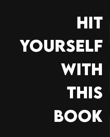
Intrusive Thoughts: Illustrative Alphabet Book
Project Details
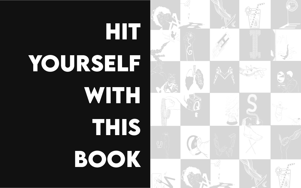
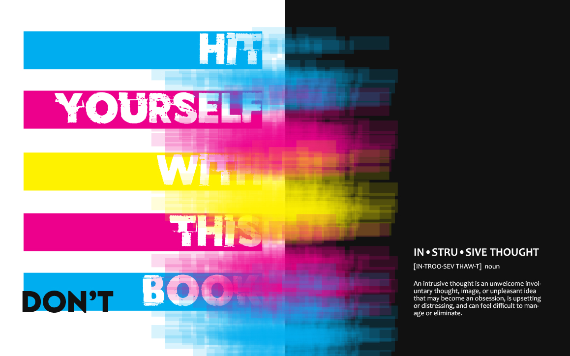
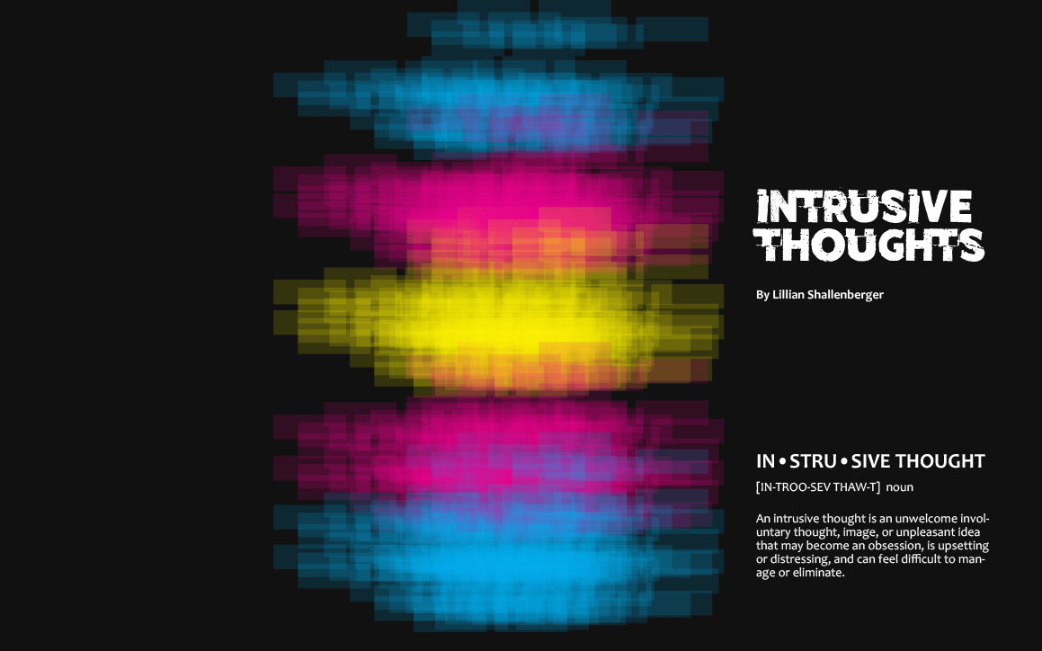
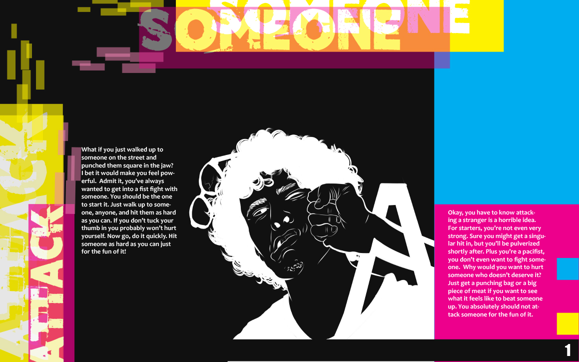
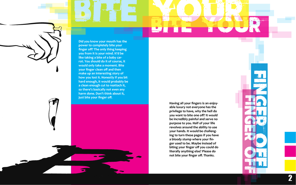
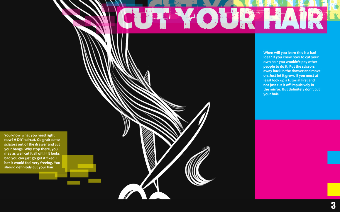
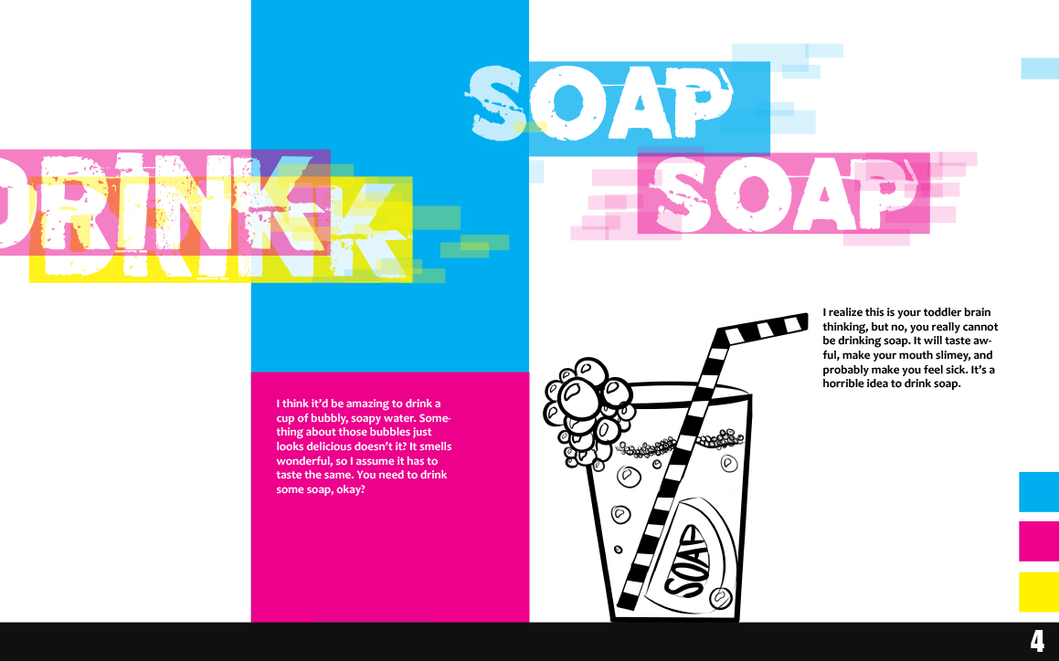
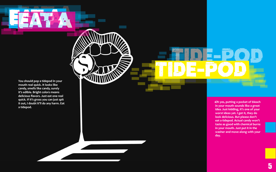
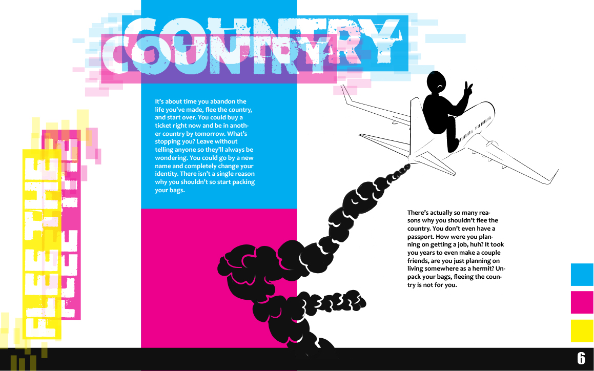
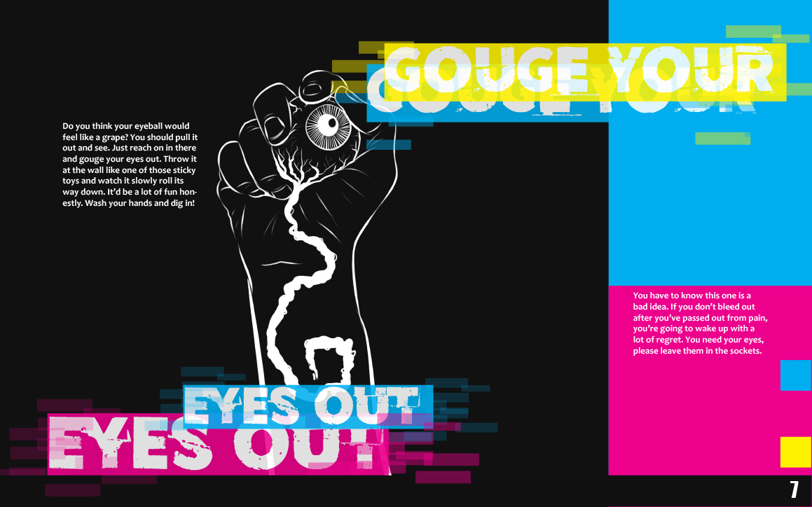
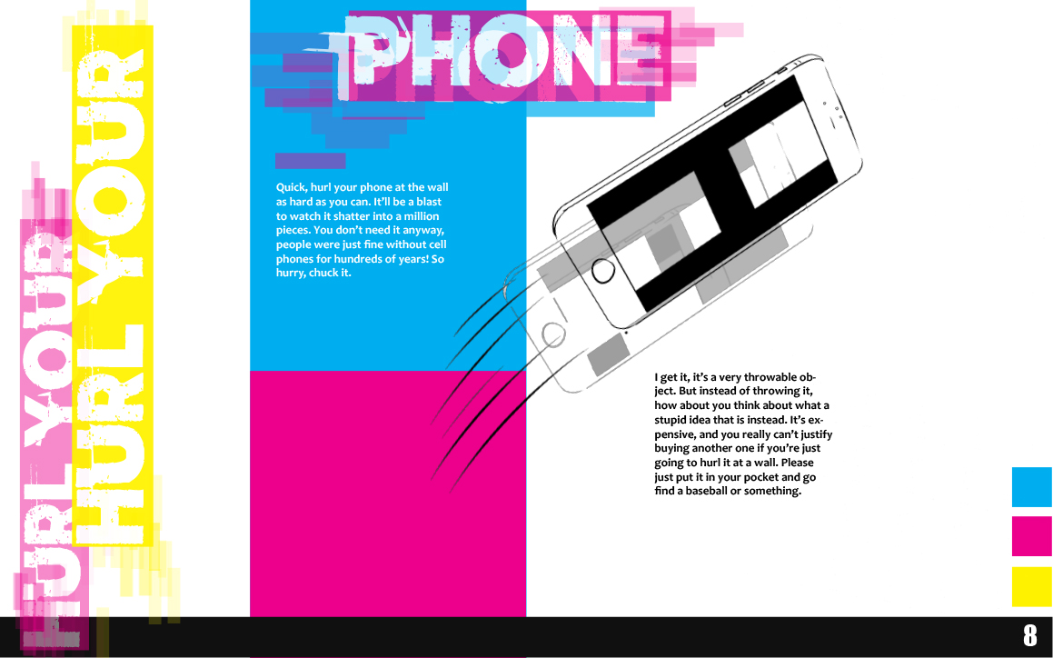
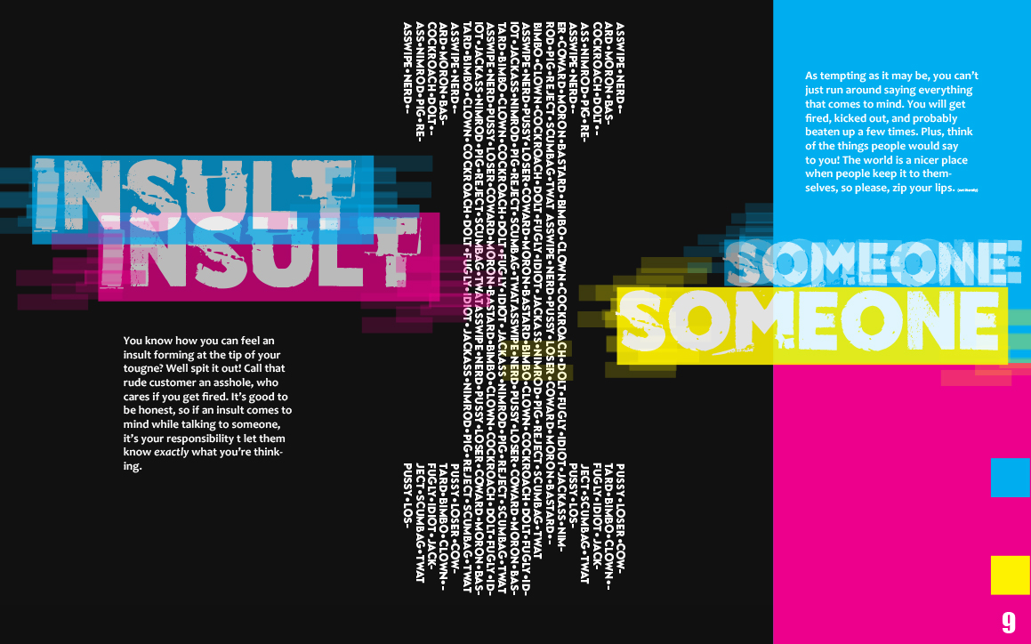
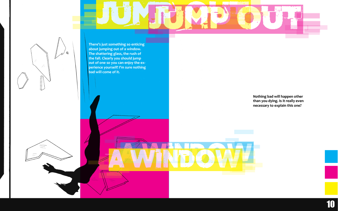
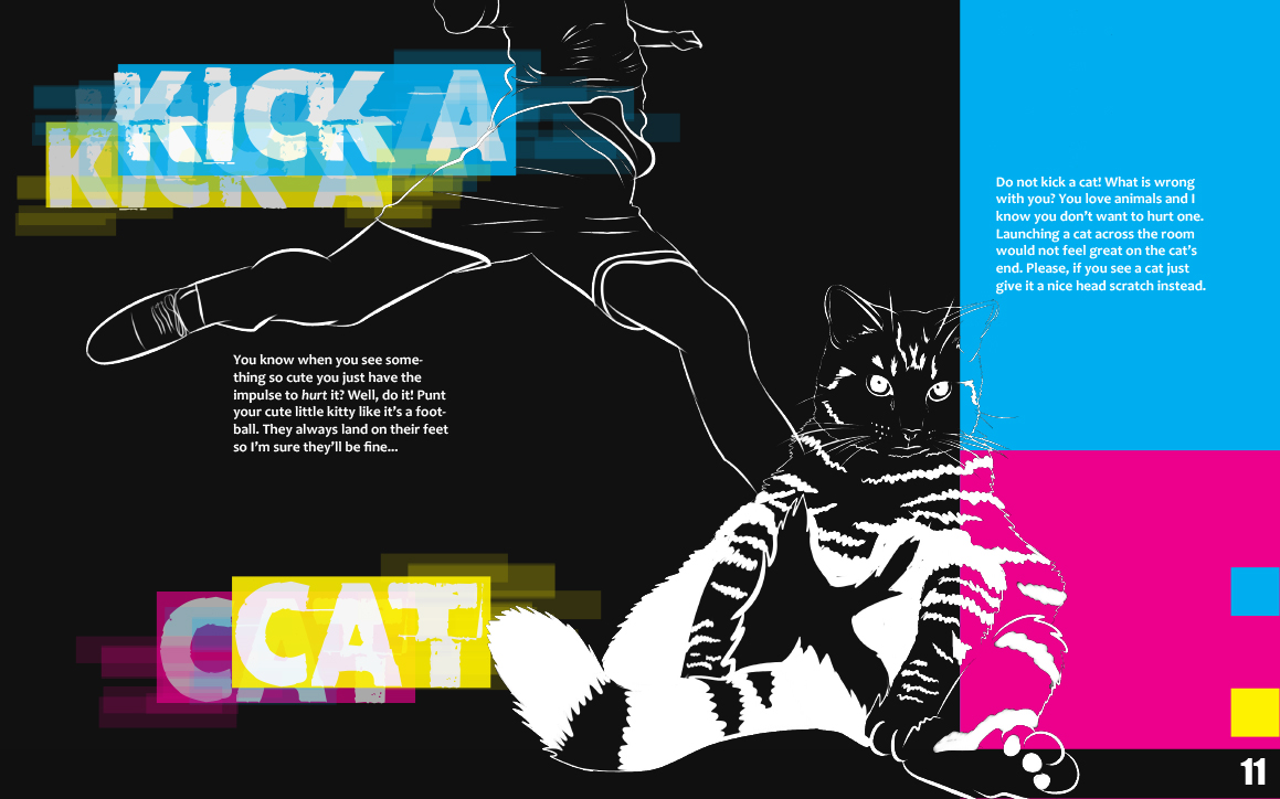
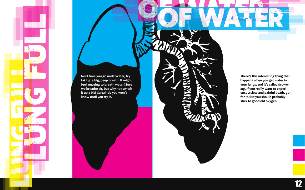
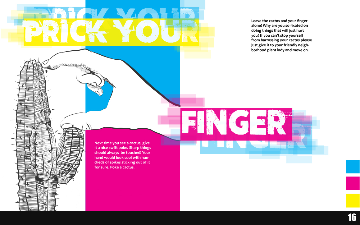
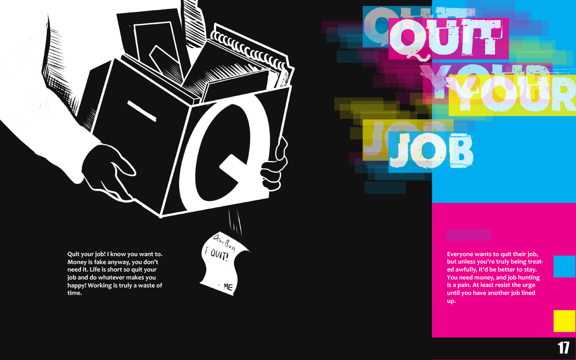
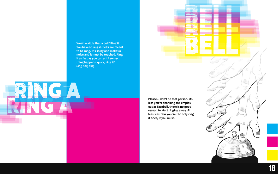
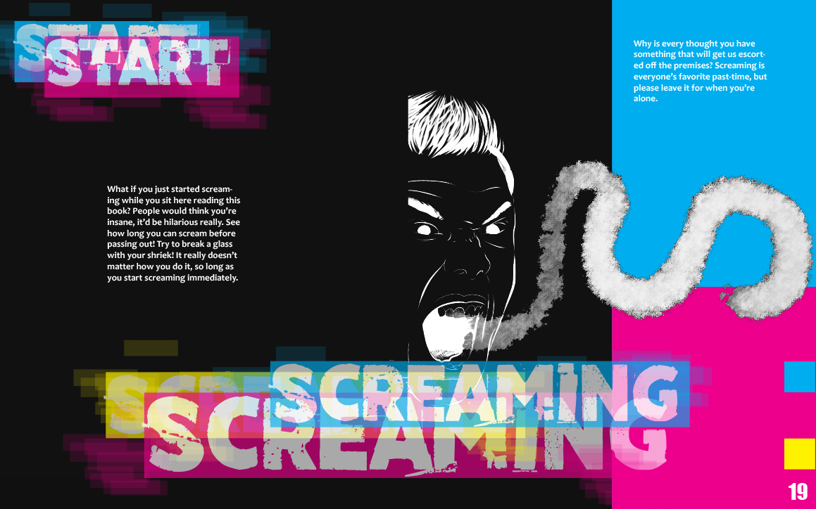
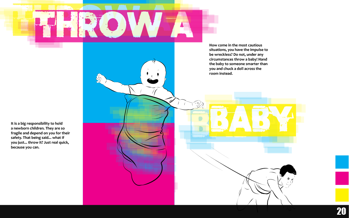
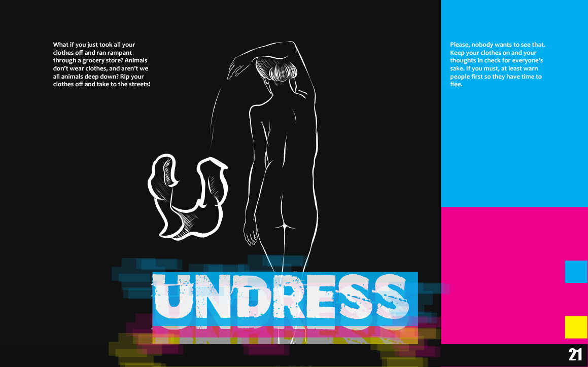
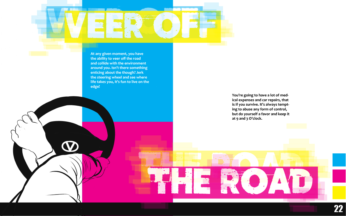
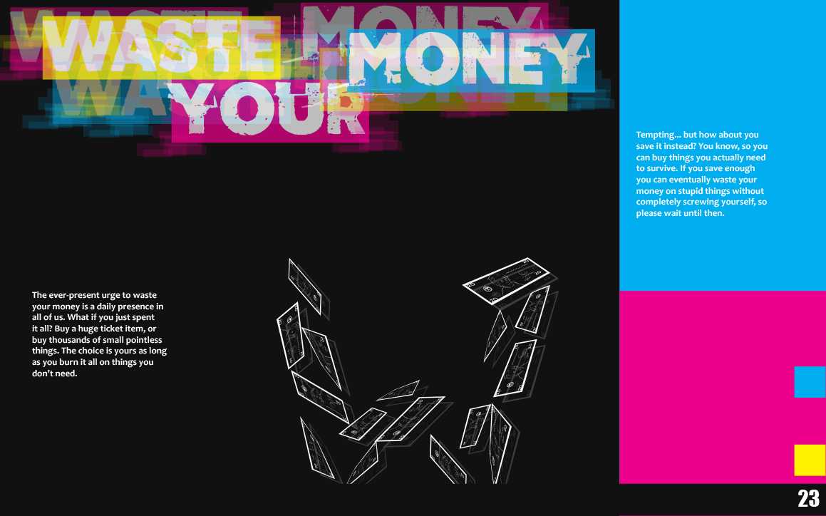
For this project, we were allowed to choose a topic we were interested in to create a typographic alphabet book. I decided to do my book on Intrusive Thoughts, a phenomenon I find very interesting because I experience them myself. For my book, I wanted to portray the troubling topic of intrusive thoughts in a humorous, engaging light. I wanted my overall design to resemble a computer glitch, because in a way, intrusive thoughts are like brain glitches. I decided to go with a CMYK palette because I wanted the visuals to be striking and hard to ignore. I wanted to emphasize contrast as much as possible, to mirror the clashing of absurd and reasonable thoughts that can occur in one’s mind. For the information of the book, I wanted to show the internal battle between the sensible left brain and the reckless right, however I decided to align them oppositely. This is because having the reasonable response to a reckless thought come first disrupted the flow for the reader. Despite this change, I think the concept of a divided brain in my layout is still present.
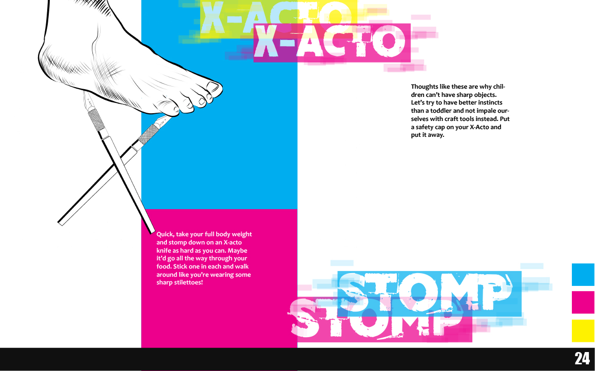
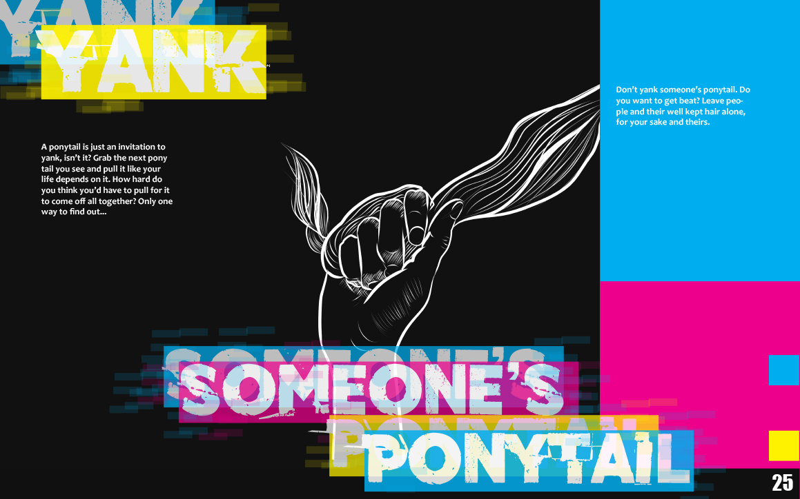
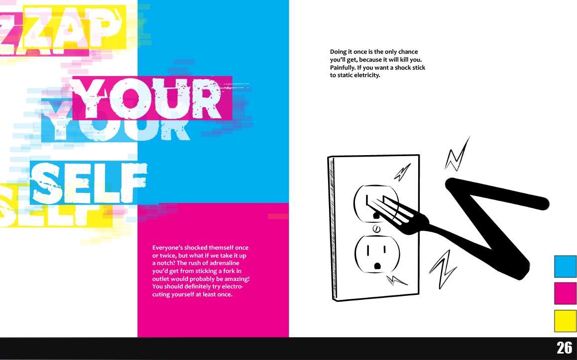
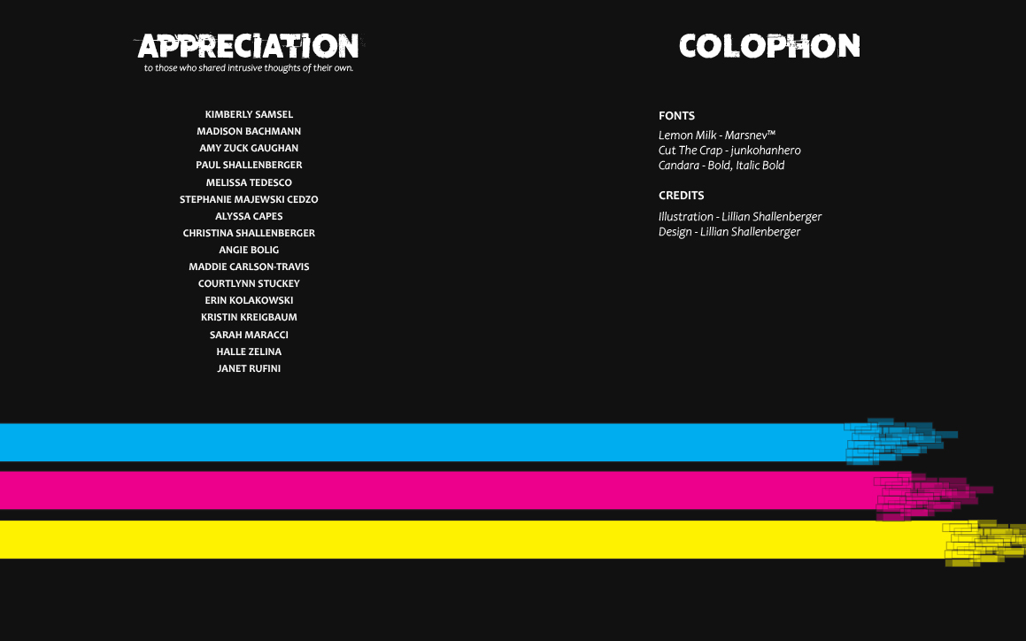
I started with simple black and white illustrations and inverted them every other color to give my spreads more variety. My design was meant to invoke a sense of chaos, as most intrusive thoughts are chaotic, while also maintaining good composition and readability. To achieve this, I established a basic grid including a sidebar on alternating pages and a footer line to carry your eye along each page. I first chose “cut the crap” as my main display font for the glitch effect it possessed. I then found “Lemon Milk” to mirror the previous font but with a more uniform and formal appearance. Lastly, I used Candara bold for my body text because it was easily readable and bold enough to see even with distracting visuals. My alignments for the typography were mostly related to lines within my illustrations or of the sidebar. I saved my most troubling intrusive thought for the center of the book, and provided a separate page after to reiterate the message and give the reader a moment to absorb and ponder what they’ve read before continuing. Lastly, for my colophon I kept with a simple design that mimicked the rest of my book, and gave credit to my fonts and the people who submitted some intrusive thoughts of their own.
Overall I think I was successful in what I set out to achieve. It was difficult to get that many illustrations done and find a way to incorporate, but I’m glad I went with that method. Having diverse illustrations for each page made it easier to make my spreads diverse and interesting while maintaining unity. I enjoyed this project a lot and am excited to be able to assemble it in the fall.